No products in the cart.
Product News
Minnesota Frost: The Icy Champions of the PWHL
Introduction: The Emergence of Minnesota Frost
The Professional Women’s Hockey League (PWHL) has marked an exciting milestone by officially naming its Minnesota team the “Minnesota Frost.” After a remarkable inaugural season where the team clinched the Walter Cup, Minnesota now boasts a name that resonates deeply with the state’s love for hockey. The Frost represents more than just a team; it symbolizes Minnesota’s icy climate and the state’s passion for the sport. With sharp branding, exciting players, and a championship under their belt, the Frost is primed for another exhilarating season.
A Journey to the Name: Minnesota’s Deep-Rooted Hockey Culture
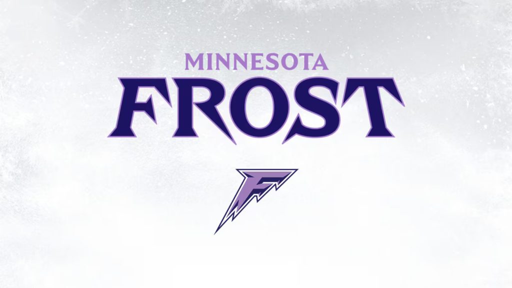
The Minnesota Frost name was not chosen lightly. Reflecting the region’s long-standing hockey tradition, the name “Frost” was selected to embody the spirit of Minnesota, known as the “State of Hockey.” Minnesota has always been synonymous with hockey, and its fans are some of the most passionate in the sport. The naming process involved consulting with local fans and stakeholders to ensure that the team’s identity matched the community’s enthusiasm. According to the PWHL, the name perfectly captures the frosty edge and determination of the team. The sharp, icicle-inspired logo reinforces this concept and ties it directly to Minnesota’s cold winters.

The Path to Championship Glory
Before the official team name was even announced, the Minnesota squad had already left a strong impression by winning the inaugural PWHL championship, lifting the Walter Cup in May 2024. The Frost’s journey through the first season was a testament to their skill and determination, as they dominated teams without the luxury of an official identity. The team’s ability to remain focused and united throughout the season shows that they have what it takes to maintain their winning ways in future campaigns. With this new chapter, they aim to solidify their presence both on and off the ice.
The Creation of a Brand: The Design Process
The PWHL worked closely with branding experts and fans to craft a distinctive identity for the Frost. The logo, featuring a bold letter “F” with icicle-like edges, highlights the team’s fierce and cold demeanor. This branding effort was part of a larger league-wide initiative, with all six teams in the PWHL unveiling their identities simultaneously. In addition to the Frost, teams like the Boston Fleet, New York Sirens, and Ottawa Charge also launched their official logos and names. Minnesota’s branding not only resonates with local fans but also sets the stage for the team to grow its fanbase nationwide.
What’s Next for the Frost?
With the new season approaching, the Minnesota Frost is poised to build on their previous success. The team’s performance in the first season has already placed them in a position of strength, but now, with a name and brand to rally behind, the stakes are higher. Players, coaches, and fans alike are excited for the future. The Frost’s general manager, Melissa Caruso, has worked hard to ensure the team remains competitive, and with their championship-winning roster, there’s no doubt that Minnesota will continue to be a dominant force in the PWHL.

The future looks bright for the Minnesota Frost as they continue to represent the State of Hockey. From their humble beginnings to championship glory, the Frost are a testament to the power of perseverance and passion. As they prepare for another season, they aim to solidify their legacy as one of the top teams in women’s professional hockey.
We’re thrilled to introduce the exclusive 2024 Minnesota Frost White Hoodie, Cap for all fans. 🎉 Don’t miss out – grab yours today!

👉 EXPLORE THE MINNESOTA FROST COLLECTION TODAY!
From Viraldes


